
Reflecting the brilliance of current colour technology, quinacridones are a contemporary painter’s greatest tool when it comes to mixing, glazing and staining. Whereas artists previously needed to choose between reds of permanency, transparency or chroma, with quinacridone colours they can have it all. Quinacridones are the pigments of our era, and Tri-Art has endeavoured to make the finest quality possible.
PRACTICE MAKES PERMANENT: A BRIEF HISTORY OF RED PIGMENTS
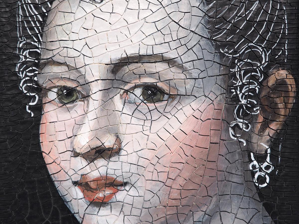
Joshua Reynolds was one of the premier painters of the 18th century. He made a great career for himself as a portraitist, cultivating a following by the wealthy and powerful of the British Empire. While enjoying fame and reputation as a great painter, Reynold’s works conversely enjoyed some degree of infamy. Perhaps not unlike Oscar Wilde’s fantastical portrait of Dorian Gray, Reynold’s portraits aged faster than their subjects. Despite being the most accomplished painter of his era, Reynold’s was not concerned with the disastrous consequences of using experimental and unstable painting materials. Almost immediately after competition Reynold’s paintings began to deteriorate in various ways. Today this is most notable in their lack of colour. Reynold’s portraits now host eerie ghosts, 18th century apparitions with grey skin to match their powdered wigs. Reynold’s grey ghosts are a result of his of carmine, a transparent red lake pigment. The pigment is at best ephemeral, made from a dye of crushed insects, it faded rapidly upon exposure to light.[1] When mixed with white, as in the case of light skin tones, unstable pigments tend to fade even faster. Reynold’s portrait of the Clive family with their maid strongly illustrates the ill suite nature of carmine as a pigment for painting. The Clive family’s skin has faded severely in stark contrast to the maid’s well-preserved complexion, likely modeled in much more stable earth colors.

Examples of Reynold’s works with good coloration remaining are exceptionally rare. We might chalk this up to a lack of modern understanding of lightfastness, but even during his lifetime Reynold’s understood the reason for his paintings’ dramatic fading – his choice of carmine red as a pigment. Reynold’s is, in fact, well quoted on the matter. “I can see no vermillion in flesh,” he is said to have retorted during an argument for his use of the fading lake colour.[2] Painters have long had access to vermillion and red earths to make opaque and very stable reds, but their range for colour mixtures would be limited by just these. Vermillion was a very orange leaning red best for warm mixtures only, and any earth red could not mix to a bright colour. Despite being highly unstable, transparent lake reds allowed for subtle flesh tints and brilliant, deep red glazes. Furthermore, many of these lake reds were cool, allowing for much more brilliant purple mixtures.
Unlike many colors that were rapidly replaced in the nineteenth century by synthetic coal tar dyes, carmine dye remained in high demand with use peaking in the latter part of the nineteenth century.[3] Since antiquity, lake colours had been made from a diverse source of plants and animals: ‘Dragon’s Blood’ came from the resin of tropical palm trees, Madder from the madder plants of the Mediterranean, and carmine (cochineal) from the scale insects of Meso-America. Unfortunately, none of these are pigments were very stable, making them vulnerable to the fading that so dramatically affected Sir Joshua Reynold’s once careful colouration. By the nineteenth century, after centuries of stagnation, alternative means of creating cool, transparent reds were in high demand.[4]


Working with inexpensive madder, new, more richly colored isolates were discovered: purpurin and the more popular alizarin. Synthetic alizarin crimson replaced natural isolates in 1868 as an even more economical and purely saturated color.[5] Alizarin crimson rapidly became a staple of the artists’ palette but remained a problematic pigment. Alizarin crimson is still liable to colour fading, particularly in watercolour.
In the 20th century advances in pigment technology allowed for more lightfast reds to be developed. Naphthol reds were an early attempt. These are somewhat lightfast, but still not nearly as stable as other modern pigment like phthalo blue. Early aniline (azo) reds were also introduction into artists’ materials without regard for their fugitive nature.[6] It wasn’t until the 1960s that moderately lightfast red azo pigments would be developed.[7] Because of the experimental nature of many materials trialed as artists’ materials in the 20th century, many painted works from this period are just as, if not more, light sensitive than historical paintings. 21st century artists now have the advantage of learning from the experimentation of the past, and the great wealth of information provided to us by modern material testing methods. With judicial selection of quality pigments, we need not see our works fade within our lifetimes.
REDISCOVERED: A HISTORY OF QUINACRIDONES
In 1927, phthalo blue truly brought the world into the modern colour era. It was super strong, brilliantly coloured, and excellently lightfast. Despite extensive experimentation, the phthalo colours remain limited to just blue and green. Inspired by the success of this small pigment family, chemists went searching for other super colours that could cover the rest of the rainbow.[8]
Quinacridone was surprisingly first synthesized in 1886. Despite its brilliant colour, the compound did not take off as a pigment. Quinacridones were likely lost amongst the sea of colourful and inexpensive dye pigments that were popular in the late 19th century. Seen in this plate from an 1886 book on artists’ color, synthetic alanine and natural vegetable dyes were the most popular for choices for reds and violets. A later colour catalogue from 1890-1910 suggests that this trended continued with many choices for madder, carmine and alizarin (no doubt these were by then the novel synthetic version) labelled somewhat as “Washes of Modern Water Colours”. Quinacridone would languish out of sight until 1955. At this time, the pigment department of Du Pont discovered that quinacridone compounds were not only brilliant in colour, but also held excellent lightfastness, a highly unique trait for a late 19th century synthetic colorant. 21st century commercial production of the pigment began first in Europe, followed by US production in the late 1950s. [9]


The quinacridones were the first modern transparent reds with outstanding light stability.[10] Initially, only available as violet, continued synthesis research in the 1960s yielded the many forms. Today quinacridone pigments are available in a range of magenta, red, and orange,[11] with 150 different variations said to exist.[12] These pigments were all developed with commercial applications like automobile finishes in mind but were almost immediately adopted into artists’ paints. As early as 1964, quinacridone violet was found in Bocour’s AquaTec acrylic line.[13]

A TRI-ART SPECIALTY: COLOURS FOR THE CONTEMPORARY PAINTER
In the mid-90s when Tri-Art was formed, there were few options for high end acrylics using cutting edge pigments. Many painters were also unfamiliar with modern colours, being trained instead by a generation still working with traditional pigments, or even just hue colours that organized modern colours into a traditional framework. Colours like Hooker’s Green, Indian Yellow and Alizarin Crimson were all still in high demand, despite almost always being formulated by modern synthetic equivalents (and of potentially dubious quality).
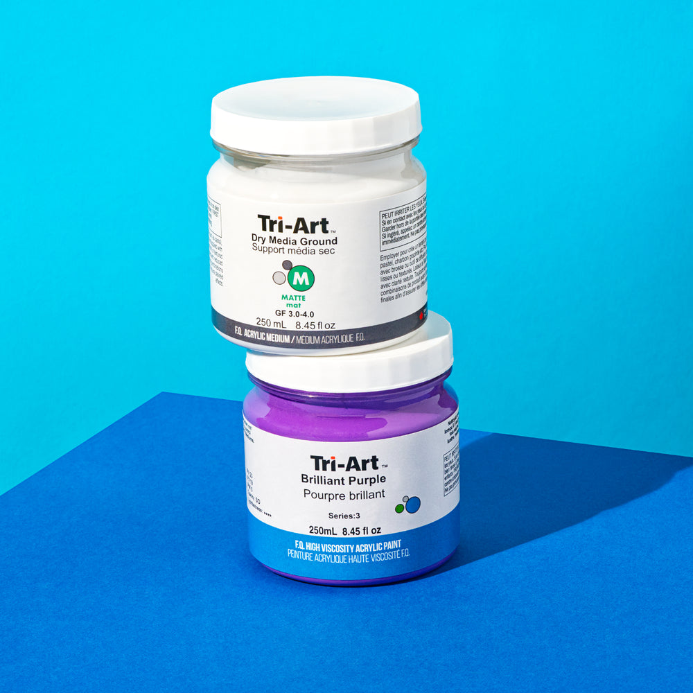
When Tri-Art first opened it didn’t carry Alizarin Crimson, it carried quinacridone red (PV 19r) and quinacridone violet (PV 19v). Tri-Art had a vision to offer clean mixing primaries that would surpass the abilities of traditional pigments or outdated hues. We didn’t want to focus on opaque cadmiums either, but transparent, high staining and high chroma colours.

At the time, quinacridone pigments were the most exciting pigment on the market, they ticked all the boxes: non-toxic, high chroma, high staining, transparent, and clean mixing. Painters, however, were unfamiliar with them and deterred by their unfamiliar mixing properties. Our in-house artist and expert Rheni Tauchid remembers having to demonstrate our quinacridone red to painters as a substitute for alizarin crimson. While she recalls it was quite a task for the staff of our flagship store, Art Noise, the efforts paid off, with the quinacridones now being our signature colours at Tri-Art.
Today there are not only many quinacridone colours to choose from, but also suppliers and standards of quality. At Tri-Art, we have gone the extra mile to extensively test the available options to ensure we can deliver the highest quality colour. Our lab is full of hundreds of swatches from colour testing these pigments. Furthermore, we’ve pushed these quinacridone pigments to the peak of their chroma and transparency. Quinacridone pigments are synthetic organics, made of tiny, ‘sticky’ particles that would rather clump together than disperse into water-based paints. Because of this, they are difficult, and time consuming to grind and disperse into water (check out this article on pigment grinding at Tri-Art for more on this topic). At Tri-Art we’ve developed our own unique dispersant package for Quinacridones that allows our pigment loading to be higher than any of our competitors. On top of this we take the time to ensure each batch of quinacridone pigment is ground out completely, sometimes taking days.

Overtime, at Tri-Art, we have pushed our lines to include a large range of quinacridone colours of the finest colour. For instance, Quinacridone scarlet was one of the most exciting advancements of its time. It was a brand-new technology that for the first time produced a modern red that was both orange in mass tone and undertone (unlike naphthol red that shifts pink). Our 1998 colour chart showcases the early adoption Quinacridone Scarlet only a few years after Tri-Art opened its doors.

Today Tri-Art carries of Quinacridone colours made from Quinacridone Red (PV 19r), Quinacridone Violet (PV 19v), Quinacridone Magenta (PR 122), and Quinacridone Scarlet (a mixture of PR 202 and pyrrole red). Keep reading on to the end to learn how to use these colours on your palette.

QUINACRIDONES: CAN YOU TEACH AN OLD MASTER NEW TRICKS?
Why paint with Quinacridones? Our expert painter Rheni Tauchid offers this advice to painters,
“Painting, especially in oil, has a very storied history with wanting to paint like the old Masters. But people forget that the old masters used highly contemporary pigments in their time.”
After the invention of Prussian blue paintings in the 18th century began to show a marked tendency toward blue. This most certainly coincides with the discovery and dissemination of Prussian blue. Likely discovered by Johann Jacob Diesbach in Berlin in 1706,[14] Prussian blue quickly spread across Europe thanks to the marketing efforts of Johann Leonard Frisch who saw the financial opportunities of the color. Unlike any other blue colour, Prussian blue was incredibly inexpensive and easily manufactured.[15] Prussian blue made it to Parisian painters in the short span of just four years where it was found in the works of masters like Antoine Watteau.[16] Over the course of the 18th century Prussian blue unquestionably decimated the use of all other blue pigments that would have once been considered ‘more traditional’.[17]

Before Prussian blue, European oil painters mainly utilized smalt blue, using ultramarine typically only when their patron would foot fit the bill, if ultramarine even could be found – the mineral pigment was exclusively mined from a few remote locations in what is now modern-day Afghanistan. In contrast to the lush, deep violet-blue of ultramarine, smalt was a somewhat dull blue. Before smalt, azurite was the most popular blue pigment, but it too was a precariously sourced product of mining. After 1523, azurite became unavailable with the collapse of European silver mining. With silver being imported from the New World, European silver mining became an unprofitable business venture.[19] As a biproduct, azurite was at the mercy of global commerce, not painting commissions. Smalt, however, remained readily available as a component of pottery glaze colours,[20] a mass production industry that allowed painters some lasting security in this colour.
Like azurite was a biproduct of silver mining, and smalt from pottery, contemporary artists’ colours are an offshoot of industrial pigment production far from its control. Today most pigments are manufactured for automobile finishes. Unlike other pigments like phthalo blues and greens that are used on mass industrial scales, quinacridones are not.[21] They are also incredibly expensive pigments, costing upwards of thirty times more than other pigments. These factors make quinacridones particularly vulnerable to shifting market forces. In just a few decades, Tri-Art has seen the loss of Quinacridone Red Light, Quinacridone Gold (PO 49)[22], and most recently Quinacridone Burnt Orange (PO 48). 2020 and the years following exposed the truly global and fragile nature of the supply chain we all rely on to produce art, an act that on the surface seems very close to home. These issues are still being resolved to this day with delays and shortages still a regular occurrence. As we also revaluate our relationship with cars globally, perhaps our industry will also have to revaluate its relationship to pigment production.


As precarious as it might sound, as with the transition from azurite to smalt to Prussian blue, art has endured when pigments have not. Furthermore, these new pigments have come to define the works of their era. Phthalo blue has undoubtedly now supplanted Prussian blue and defined a new generation of modern painting. Contemporary artists today may want to look at quinacridones as such pigments of our era. In her own work, Rheni thinks of quinacridones as a contemporary artist’s superpower. While her work is abstract, many traditionalist painters today also work with quinacridone colours. Popular classical, representational painters on social media like Andrew Tischler and Florent Farges both use quinacridone magenta in their palette.
MAJESTIC MAGENTAS: A PRACTICAL QUIDE TO MIXING WITH QUINACRIDONES
Quinacridones are clean mixing because of their transparency and consistency between mass tone and undertone. Most other red colours like Alizarin Crimson are ‘dirty’ colours. Alizarin Crimson is difficult to characterize because its mass tone is a warm brick red, while its undertone is cooler purple red. Quinacridones like violet and red can quite readily shift towards their magenta-pink undertones, requiring a substantial build-up of colour to retain mass tone. The brilliance of quinacridone orange colours are best brought out by revealing their undertones, otherwise they tend to appear more brown than golden-orange. Thus, as a rule of thumb, quinacridones are best used to mix, glaze and stain. The easiest way to learn colour mixing with the Quinacridones is to swap the cool red in your palette, traditionally Alizarin Crimson, with Quinacridone Red, Violet or Magenta.
Quinacridone Pigments Currently Available at Tri-Art:
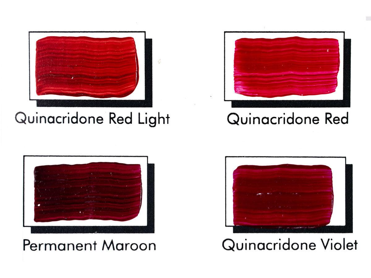
Quinacridone Red (PV 19r)
Brilliant red in mass tone, with pink, magenta undertone. Also generally called ‘quinacridone rose’ due to its tendency towards pink rather than red. Transparent, highly staining with good tinting strength.
Quinacridone Scarlet (PR 202 + Pyrrole Red)
Brilliant orange red in mass tone and under tone. Transparent and heavily staining.
Quinacridone Magenta (PR 122)
Cool shaded red, blue leaning magenta in mass tone and undertone. Transparent, strongly staining, but weakly tinting.
Quinacridone Violet (PV 19v)
Cool blue-violet in mass tone, with blue leaning magenta under tone. Transparent, highly staining with good tinting strength.
Use this handy chart to find the quinacridone colour that best suits your work. Tri-Art offers a range of single pigment and pre-mixed colours.

Final Tips for mixing with Quinacridones:
- Mixing cool, blue-leaning quinacridones (violet, magenta, and red) with transparent or semi-transparent warm earth reds (like our transparent red oxide) yields delicious alizarin, crimson, lake-like reds. Tri-Art offers several premade red-orange mixtures in this colour family that can help paint right out of the tube. These are the ultimate, lightfast, rich glaze colours that replace traditional alizarin crimson and other red lake pigments.
- Additions of white yield brilliant tints that hold up to titanium white without appearing washed out. Tri-Art offers three tints in this family.
- Mixtures of quinacridones are brighter than individual components,[23] so using a mixture of two quinacridone colours can also yield more intensely saturated colour.
BIBLIOGRAPHY
Bartoll, Jen, ‘The Early Use of Prussian Blue in Paintings’, in 9th International Conference on NDT of Art (Jerusalem: NDT.net, 2008)
Berrie, Barbara, ‘Prussian Blue’, in Artists’ Pigments: A Handbook of Their History and Characteristics. Volume 3 (Washington DC: National Gallery of Art, 1997)
Berrie, Barbara H, ‘Mining for Color: New Blues, Yellows, and Translucent Paint’, Early Science and Medicine, 20.4/6 (2015), 308–34 <http://www.jstor.org/stable/24760385>
Keijzer, Matthijs, ‘The Delight of Modern Organic Pigment Creations’, in Issues in Contemporary Oil Paint, 2014, pp. 45–73 <https://doi.org/10.1007/978-3-319-10100-2_4>
Keijzer, Matthijs De., ‘Microchemical Analysis on Synthetic Organic Artists’ Pigments Discovered in the Twentieth Century’, in ICOM Committee for Conservation 9th Triennial Meeting: Dresden, German Democratic Republic, 26-31 August 1990: Preprints, ed. by Kirsten Grimstad (Paris: ICOM Committee for Conservation, Paris, France, 1990), p. pp.220-225, 1 table, refs.
KIRBY, J O, MARIKA SPRING, and CATHERINE HIGGITT, ‘The Technology of Eighteenth– and Nineteenth–Century Red Lake Pigments’, National Gallery Technical Bulletin, 28 (2007), 69–95 <http://www.jstor.org/stable/42616200>
Lee, Raymond L, ‘American Cochineal in European Commerce, 1526-1625’, The Journal of Modern History, 23.3 (1951), 205–24 <http://www.jstor.org/stable/1872704>
Lomax, Suzanne Quillen, ‘Phthalocyanine and Quinacridone Pigments: Their History, Properties and Use’, Studies in Conservation: Reviews in Conservation 6, 50.sup1 (2005), 19–29 <https://doi.org/10.1179/sic.2005.50.Supplement-1.19>
Lomax, Suzanne Quillen, and Tom Learner, ‘A Review of the Classes, Structures, and Methods of Analysis of Synthetic Organic Pigments’, Journal of the American Institute for Conservation, 45.2 (2006), 107–25 <http://www.tandfonline.com/doi/abs/10.1179/019713606806112540>
MacEvoy, Bruce, ‘Earth Pigments’, Handprint: Guide to Watercolor Pigments, 2015 <https://www.handprint.com/HP/WCL/watere.html> [accessed 13 July 2021]
Mühlethaler, Bruno, and Jean Thissen, ‘Smalt’, in Artists’ Pigments: A Handbook of Their History and Characteristics. Volume 2 (Washington DC: National Gallery of Art, 1993)
Reynolds, J, and H W Beechey, The Literary Works of Sir Joshua Reynolds: First President of the Royal Academy. To Which Is Prefixed a Memoir of the Author; with Remarks on His Professional Character, Illustrative of His Principles and Practice, The Literary Works of Sir Joshua Reynolds ...: To Which Is Prefixed a Memoir of the Author; with Remarks on His Professional Character, Illustrative of His Principles and Practice (London: H.G. Bohn, 1852) <https://books.google.ca/books?id=UNbqUssOV3sC>
Schweppe, Helmut, and Heinz Roosen-Runge, ‘Carmine - Cochineal Carmine and Kermes Carmine’, in Artists’ Pigments: A Handbook of Their History and Characteristics, ed. by Robert L Feller (Washington DC: National Gallery of Art, Washington DC, United States, 1986), p. pp.255-283
Zoriana, L., ‘Blue in Eighteenth-Century England: Pigments and Usages’, XVII-XVIII, 2018 <https://doi.org/10.4000/1718.1214>
ENDNOTES
[1] Helmut Schweppe and Heinz Roosen-Runge, ‘Carmine - Cochineal Carmine and Kermes Carmine’, in Artists’ Pigments: A Handbook of Their History and Characteristics, ed. by Robert L Feller (Washington DC: National Gallery of Art, Washington DC, United States, 1986), p. pp.255-283.
[2] J Reynolds and H W Beechey, The Literary Works of Sir Joshua Reynolds: First President of the Royal Academy. To Which Is Prefixed a Memoir of the Author; with Remarks on His Professional Character, Illustrative of His Principles and Practice, The Literary Works of Sir Joshua Reynolds ...: To Which Is Prefixed a Memoir of the Author; with Remarks on His Professional Character, Illustrative of His Principles and Practice (London: H.G. Bohn, 1852) <https://books.google.ca/books?id=UNbqUssOV3sC>.
[3] Raymond L Lee, ‘American Cochineal in European Commerce, 1526-1625’, The Journal of Modern History, 23.3 (1951), 205–24 <http://www.jstor.org/stable/1872704>.
[4] Jo Kirby, Marika Spring, and Catherine Higgitt, ‘The Technology of Eighteenth– and Nineteenth–Century Red Lake Pigments’, National Gallery Technical Bulletin, 28 (2007), 69–95 <http://www.jstor.org/stable/42616200>.
[5] Kirby, Spring, and Higgitt, ‘The Technology of Eighteenth– and Nineteenth–Century Red Lake Pigments’.
[6] Suzanne Quillen Lomax and Tom Learner, ‘A Review of the Classes, Structures, and Methods of Analysis of Synthetic Organic Pigments’, Journal of the American Institute for Conservation, 45.2 (2006), 107–25 <http://www.tandfonline.com/doi/abs/10.1179/019713606806112540>.
[7] Lomax and Learner.
[8] Matthijs Keijzer, ‘The Delight of Modern Organic Pigment Creations’, in Issues in Contemporary Oil Paint, 2014, pp. 45–73 <https://doi.org/10.1007/978-3-319-10100-2_4>.
[9] Matthijs De. Keijzer, ‘Microchemical Analysis on Synthetic Organic Artists’ Pigments Discovered in the Twentieth Century’, in ICOM Committee for Conservation 9th Triennial Meeting: Dresden, German Democratic Republic, 26-31 August 1990: Preprints, ed. by Kirsten Grimstad (Paris: ICOM Committee for Conservation, Paris, France, 1990), p. pp.220-225, 1 table, refs.
[10] Suzanne Quillen Lomax, ‘Phthalocyanine and Quinacridone Pigments: Their History, Properties and Use’, Studies in Conservation: Reviews in Conservation 6, 50.sup1 (2005), 19–29 <https://doi.org/10.1179/sic.2005.50.Supplement-1.19>.
[11] Matthijs De. Keijzer.
[12] Lomax.
[13] Lomax.
[14] Barbara Berrie, ‘Prussian Blue’, in Artists’ Pigments: A Handbook of Their History and Characteristics. Volume 3 (Washington DC: National Gallery of Art, 1997).
[15] Jen Bartoll, ‘The Early Use of Prussian Blue in Paintings’, in 9th International Conference on NDT of Art (Jerusalem: NDT.net, 2008).
[16] Bartoll.
[17] L. Zoriana, ‘Blue in Eighteenth-Century England: Pigments and Usages’, XVII-XVIII, 2018 <https://doi.org/10.4000/1718.1214>.
[18] Bartoll.
[19] Barbara H Berrie, ‘Mining for Color: New Blues, Yellows, and Translucent Paint’, Early Science and Medicine, 20.4/6 (2015), 308–34 <http://www.jstor.org/stable/24760385>.
[20] Bruno Mühlethaler and Jean Thissen, ‘Smalt’, in Artists’ Pigments: A Handbook of Their History and Characteristics. Volume 2 (Washington DC: National Gallery of Art, 1993).
[21] Lomax.
[22] Bruce MacEvoy, ‘Earth Pigments’, Handprint: Guide to Watercolor Pigments, 2015 <https://www.handprint.com/HP/WCL/watere.html> [accessed 13 July 2021].
[23] Lomax.